Zovora / Personal finance
Money, with
a clearer picture.
A digital product built around an everyday question: what’s actually safe to spend?
- Client
- Zovora
- Experience
- Website & product
The challenge
A balance isn’t
the whole story.
Rent, bills and repayments can already be spoken for, even while the money is still in the account. Zovora brings those commitments into the picture before the next payday.
The design challenge is clarity: give people one useful starting point, then make the detail behind it easy to understand.
The product experience
The number first.
Its workings, close by.
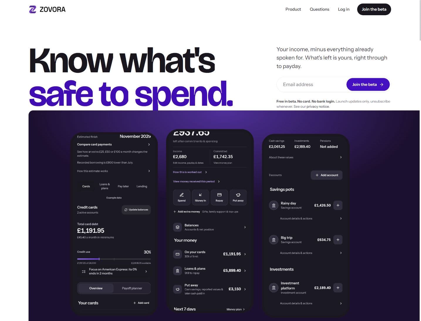
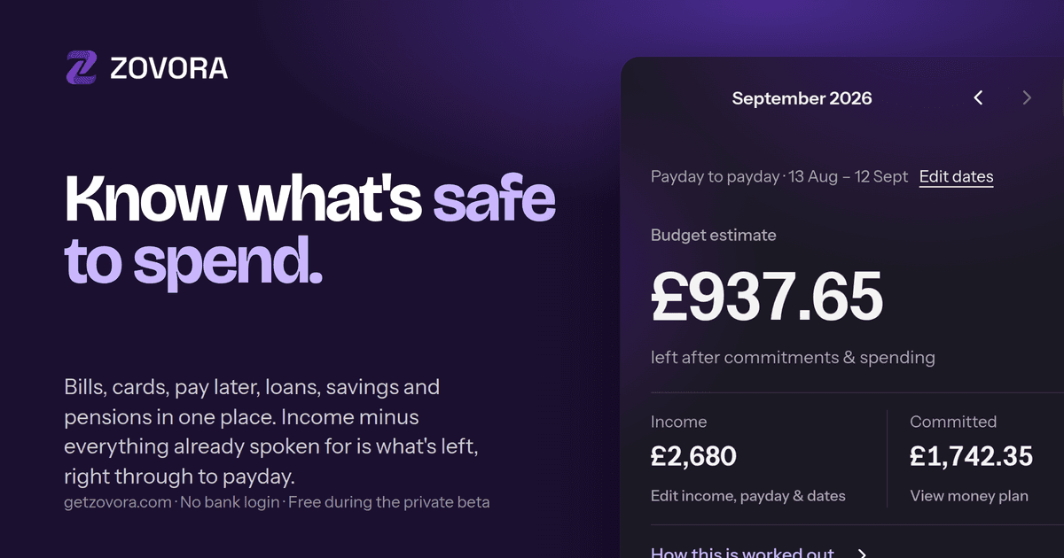
The payday period, income and committed money explain the estimate. The detail supports the decision, instead of competing with it.
From first visit to understanding
Make the purpose
impossible to miss.
A promise people understand.
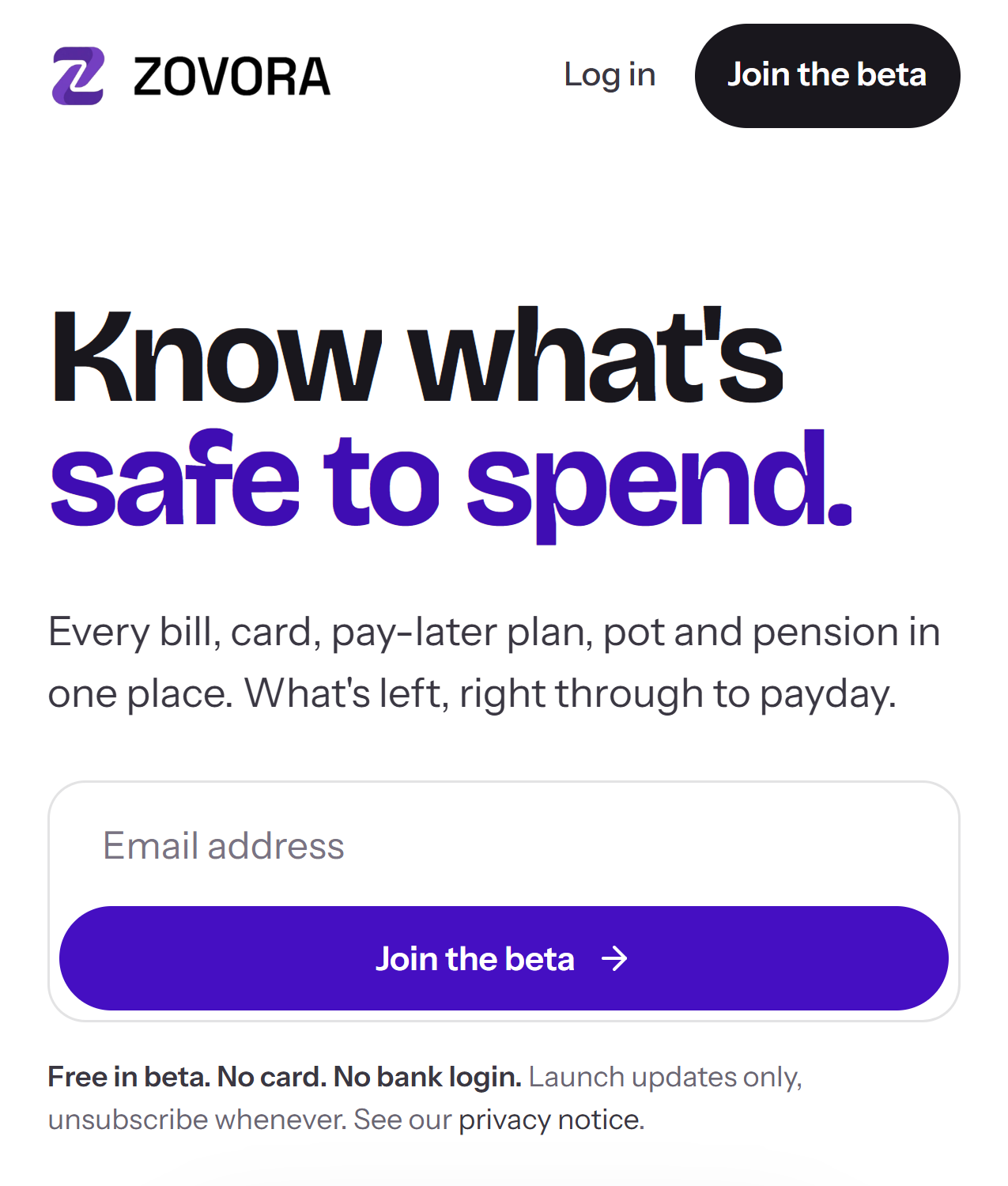
“Know what’s safe to spend” explains the benefit before asking anyone to learn the product.
Show the thing itself.
Real screens put the experience in view. The website shows what the product does, with example data clearly identified.
One clear next step.
The beta invitation stays simple. The cost and sign-up expectations sit beside the form, where people need them.
The finished experience
A useful idea.
Clear from the first screen.
A direct introduction to Zovora, with a recognisable visual identity and the product doing the explaining.
Talk to us about your projectAnother perspective
OTA Lifestyle
Fitness, community and the people behind it.